The Sizzle theme for Sphinx
This documentation describes Sizzle, a theme for Sphinx. This theme was inspired by another theme, Guzzle. Sizzle uses some of the styling elements of Guzzle, but has diverged quite a bit, both in terms of styling and other functionality.
The repository where this theme is developed is to be found here.
Theme Options
Sizzle inherits from Sphinx’s basic theme. The following theme options are defined:
globaltoc_collapse– as for Guzzle: this determines whether the global TOC shown in the sidebar is collapsed or not. Defaults tofalse.globaltoc_depth– as for Guzzle: the depth to which the global TOC is expanded. Defaults to5.globaltoc_includehidden– as for Guzzle: whether to include hidden entries in the global TOC. Defaults totrue.project_logo_name– this replaces Guzzle’sproject_nav_name. The name change reflects that the value can be shown elsewhere than in a navigation panel.sitemap_url– this replaces Guzzle’sbase_url. The new name better reflects how the value is used - as a base URL for sitemap links.google_fonts– this allows you to specify additional Google fonts to be included for use in any custom styles. Defaults toNone.google_analytics_id– this replaces Guzzle’sgoogle_analytics_account. The name better reflects that the value is a tracker ID.show_index– controls whether a link to the index is shown in the header. This defaults totrue- set it toFalseto hide the link.show_filter– controls whether a filter to apply to TOC titles is shown. This defaults totrue- set it toFalseto hide the filter (which is not needed if you have a short enough list of entries in the TOC).enable_tooltips– controls if tooltips are shown. This defaults totrue- set it toFalseto disable tooltips.glossary_permalinks– controls if glossary terms have permalinks. This defaults totrue- set it toFalseto disable the permalinks.custom_data– any custom data used by the theme. This defaults to an empty dictionary. This data needs to be loaded by JavaScript code in the HTML documentation, and so it should only contain content which is amenable to being serialized using JSON.
New in version 0.0.9: The custom_data theme element was added.
Layout
The layout has a scrolling area, consisting of sidebar and content, between a fixed header and footer. The footer is small (for copyright information and links) and the header has the following elements:
- A gradient background
- The project name (as determined by
project_logo_name). Except when in the home page, you can click on this to get to the home page - The title of the current document
- The search box, assuming the browser window is wide enough. If it isn’t, the search box relocates to the top of the sidebar.
- A link to the index. This is conditionally visible (controlled by
the
show_indextheme option) and styled as a button - A link to the source for the current page, if available. This is conditionally
visible (controlled by the
show_sourceoption) and styled as a button - Links (styled as buttons) to take you to previous and next pages, if any
The sidebar and content area can scroll independently.
Sidebar
The sidebar contains the following, from top to bottom:
If the browser window isn’t wide enough to accommodate it, the search box.
The heading “Table of Contents”, alongside which there is a left chevron ( ) which can be clicked on to collapse the sidebar.
A “Filter by title” input box. If there is a long list of TOC entries, this is handy to be able to filter the TOC entries by title. If you type into it, only TOC entries with titles matching the filter text will be shown. The
show_filtertheme option can be used to control the visibility of the box.The input box is marked as ‘sticky’, so that if there is a lot of text in the sidebar and you scroll down, the input box still remains visible so that you don’t need to scroll all the way back to the top before you can use it.
If the sidebar is collapsed, you can bring it back by hovering the mouse at the left edge of the browser window for a second or two.
You can also hide and show the sidebar via the keyboard:
- Press Control-left arrow to hide it.
- Press Control-right arrow to show it.
Typography
Font Awesome 4.7.0 is integrated. You can use the markup role
fato introduce a Font Awesome icon into your content. For example, the markup:fa:`diamond`produces in the finished output. You can append additional classes separated by commas, and they will be added to the icon. For example,:fa:`diamond,foo,bar`will have classesfooandbaradded to the icon. You can inspect this in your browser:Iconify Icons (open source) are integrated. You can use the markup role
iconto introduce an SVG icon into your content. for example, the markup:icon:`octicon:git-branch-24`produces in the finished output. The icon name is composed of the icon set identifier and the icon identifier separated by a colon. After the icon name, you can append a height and additional CSS classes, all separated by commas. The height needs to be an integer or floating-point number immediately followed by an optional unit such aspx,em, orrem(assumed to bepxif omitted). Thus,:icon:`octicon:git-branch-24,1.25em,foo,bar`will produce in the output. You can easily include emojis – for example, the markup:icon:`noto:rolling-on-the-floor-laughing`will produce in the output.The produced icon element will have the
iconifyclass added automatically.There are over 100,000 icons available - see the available icon sets. Sets include more recent Font Awesome, Octicons, Material Design, VS Code and many more.
If the named icon isn’t found, an error will be raised.
Document and section titles use Source Serif Pro.
The default body font is Roboto, falling back to Guzzle’s slightly less compact choice of Open Sans.
The monospace font used for code blocks is Iosevka, which is a condensed font allowing more content to be shown than the fallbacks of Roboto Mono, Source Code Pro and Consolas. An example:
@real fox.quick(h) { *is_brown && it_jumps_over(doges.lazy) }
New in version 0.1.0: Iconify icon support was introduced.
Google Fonts
If you want to use other Google fonts in your documentation, you can do this via a theme option:
html_theme_options = {
    # other stuff omitted
    'google_fonts': ['Acme', 'Raleway:400,700'],
    # other stuff omitted
}
This would make the Acme and Raleway fonts (the latter with the
specific weights indicated) for use in your documentation, so that you could
use Acme and Raleway in font-family values in your custom CSS.
Custom Roles
This theme adds two specific roles which you might find useful in documenting your projects:
The
farole, as described above.A generic
spanrole, which can be used as follows: the markup:span:`c1,c2,c3|some text`will result in the output<span class="c1 c2 c3">some text</span>
This isn’t intended to be used to provide lots of ad-hoc styles (which would detract from the quality of the documentation), but it can be useful in some scenarios (such as trying things out). You can, of course, create your own roles in reStructuredText markup using the role directive
.. role:: <rolename>This approach is preferable when your usage of a particular style is systematic rather than ad hoc.
The sections on Summary-Detail Lists and Providing Customized Tooltips give examples where the
spanrole can be useful.
Use of JavaScript, CSS and font assets
The version of jQuery used is 3.3.1. The version of Bootstrap used is 3.3.7. These are loaded from CDN, as are the fonts. No additional external assets beyond these are used, though you can add some in the usual way to a specific project – see the section Custom Styles and JavaScript for more details.
Styling Lists using Font Awesome
You can style bulleted lists using Font Awesome. For example, the following list:
- Arcturus
- Betelgeuse
- VY Canis Majoris
was produced using this markup:
.. cssclass:: styled-list using-star

* Arcturus
* Betelgeuse
* VY Canis Majoris
A class starting with using- is used to style the list, with using- being
replaced by fa- in the actual style applied.
You can override individual items with specific icons. For example,
- Arcturus
- Betelgeuse
- VY Canis Majoris
was produced by this markup:
.. cssclass:: styled-list using-star

* :fa:`star-o` Arcturus
* :fa:`star-half-o` Betelgeuse
* VY Canis Majoris
Summary-Detail Lists
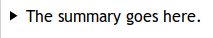
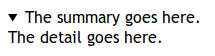
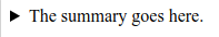
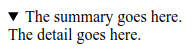
HTML5 has a handy feature - summary-detail lists, which are marked up like this:
<details>
  <summary>The summary goes here.</summary>
  <p>The detail goes here.</p>
</details>
The idea is that the whole thing can be closed (when only the summary is visible) or open (when both the summary and detail parts are visible). However, browser support is patchy and inconsistent, and styling options are limited.
Here’s how the element looks when open and closed in Firefox and Chrome:
| Closed (Firefox) | Open (Firefox) | Closed (Chrome) | Open (Chrome) |
|---|---|---|---|
|
|
|
|
Of course, docutils and Sphinx don’t offer any reStructuredText markup which maps to this HTML5 element. With the Sizzle theme, you can achieve a similar effect like this:
.. cssclass:: summary-detail

* :span:`The summary goes here.`

  The detail goes here.
The Sizzle theme code looks for this specific CSS class and arranges for it to be shown like this:
The summary goes here.
Custom Styles and JavaScript
If you have custom styles and/or JavaScript, you can install them in one of
two ways, depending on the version of Sphinx you’re using. If you’re using
Sphinx 1.8 or later, you should use configuration options in conf.py
like this:
html_css_files = ['css/project.css']
html_js_files = ['js/project.js']
The CSS file will be loaded after Sizzle’s own CSS, allowing you to tweak styles where needed. The JavaScript file will be added after all other external JavaScript files. Bear in mind that the Sizzle theme arranges to first add a JavaScript object to the DOM using a jQuery call:
$(document).data('sizzle', {on_load: []}); // code in the Sizzle theme
This is done before your custom JavaScript is included. If you want to have some JavaScript code of yours called after the entire document is loaded, you can do something like
function my_custom_function() {
  // whatever
}

var sizzle = $(document).data('sizzle');

sizzle.on_load.push(my_custom_function);
in your custom JavaScript file. When the document has loaded, the Sizzle
theme’s code calls any functions pushed onto the on_load array:
$(document).ready(function() {  // code in the Sizzle theme

  // other stuff omitted ...

  var sizzle = $(document).data('sizzle');

  if (sizzle.on_load) {
    sizzle.on_load.forEach(function(f) {
      f();
    });
  }

  // other stuff omitted ...

}
So your my_custom_function should get called once the document has loaded.
Example – styling columns in a table
Here’s an example function which I implemented for a project, using the functionality described above:
function add_column_styles() {
  $('table').each(function() {
    $(this).find('tr').each(function() {
      $(this).find('td, th').each(function(i) {
        $(this).addClass('col-' + i);
      });
    });
  });
}
This adds a col-N class to every cell in the Nth column of every table,
including header rows. By judicious application of CSS, you might be able to
use this approach to style tables in your content as you wish. For instance,
/* centre all columns except the first */
#some-table td:not(.col-0), #some-table th:not(.col-0) {
  text-align: center;
}

/* apply padding to the first column only */
#some-table td.col-0, #some-table th.col-0 {
  padding-left: 6px;
}
Device-Friendliness
The theme adapts well to smaller screens, as shown in the following images.
| Appearance on a small screen | Navigation menu on a small screen |
|---|---|
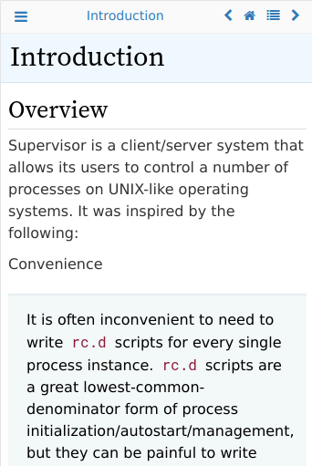
|
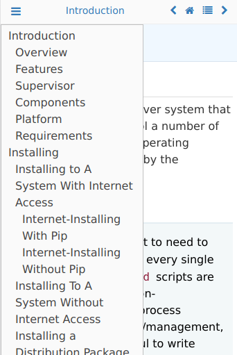
|
Glossary Improvements
Starting with version 0.0.9, there have been some improvements to Sphinx glossary functionality.
Tooltips
By default, you can see tooltips when you hover over a glossary term in documentation. You can try them out in the Supervisor documentation set: there are some glossary terms at the top of the home page - just hover over them to see the tooltips with the glossary definitions of those terms.
You can disable tooltips by setting enable_tooltips to False in the
theme options.
New in version 0.0.9: The tooltip functionality was added and applied to glossary terms.
Permalinks
In the glossary, the term headings have a hover-over permalink which allows you to bookmark them by right-clicking – the same as headings.
You can disable glossary permalinks by setting glossary_permalinks to
False in the theme options.
Code Block Improvements
Starting with version 0.0.9, code blocks with captions get a little button which, when clicked, copies the contents of the code block to the clipboard. The idea was shamelessly borrowed from recent Django documentation! Here’s an example:
def dump_node(node, level=0, file=sys.stdout):  # used for debugging only
    print('%s%r' %('  ' * level, node), file=file)
    for child in node.children:
        dump_node(child, level + 1, file=file)
New in version 0.0.9: The code block copy functionality was added.
Providing API Tooltips
Starting with version 0.1.2, you can add tooltips derived from docstrings in your module code. To do this, you need to
set up a JSON file containing the HTML snippets for your tooltips, and make use of it in your conf.py. Before
discussing how to do that in more detail, you might want to see the effect in built documentation. An example of
documentation with API tooltips can be seen for the pagesign project — follow the link (it should open in a new tab) and
then, in the linked page, hover over the links in the paragraph for Identity, encrypt(), decrypt(),
sign() and verify(). You should see tooltips for the corresponding code elements.
To achieve the same effect in your documentation, you need to take the following steps.
Create a JSON file which maps fully-qualified API endpoints to HTML snippets to be displayed in the tooltips for those endpoints. An example of such a file (from the
pagesignproject) is as follows.hover.json¶{ "pagesign.CryptException": "<div class=\"hovertip\">\n<div class=\"attr class\">\n<span class=\"def\">class</span>\n<span class=\"name\">CryptException</span><wbr/>(<span class=\"base\">builtins.Exception</span>):\n\n \n </div>\n<div class=\"docstring\"><p>Base class of all exceptions defined in this module.</p>\n</div>\n</div>", "pagesign.Identity": "<div class=\"hovertip\">\n<div class=\"attr class\">\n<span class=\"def\">class</span>\n<span class=\"name\">Identity</span>:\n\n \n </div>\n<div class=\"docstring\"><p>This class represents both remote identities (used for encryption and verification\nonly) and local identities (used for all functions - encryption, decryption,\nsigning and verification).</p>\n</div>\n</div>", "pagesign.Identity.encoding": "<div class=\"hovertip\">\n<div class=\"attr variable\">\n<span class=\"name\">encoding</span><span class=\"default_value\"> = 'utf-8'</span>\n</div>\n</div>", "pagesign.Identity.export": "<div class=\"hovertip\">\n<div class=\"attr function\">\n<span class=\"def\">def</span>\n<span class=\"name\">export</span><span class=\"signature pdoc-code condensed\">(<span class=\"param\"><span class=\"bp\">self</span></span><span class=\"return-annotation\">):</span></span>\n</div>\n<div class=\"docstring\"><p>Export this instance. Only public attributes are preserved in the export - it\nis meant for sending to someone securely.</p>\n</div>\n</div>", "pagesign.Identity.imported": "<div class=\"hovertip\">\n<div class=\"attr function\">\n<div class=\"decorator\">@classmethod</div>\n<span class=\"def\">def</span>\n<span class=\"name\">imported</span><span class=\"signature pdoc-code condensed\">(<span class=\"param\"><span class=\"bp\">cls</span>, </span><span class=\"param\"><span class=\"n\">d</span>, </span><span class=\"param\"><span class=\"n\">name</span></span><span class=\"return-annotation\">):</span></span>\n</div>\n<div class=\"docstring\"><p>Return a remote identity instance created from <em>d</em> and with local name <em>name</em>.\nThe dictionary must contain the public attributes <em>created</em>, <em>crypt_public</em>,\n<em>sign_public</em> and <em>sign_id</em> (which will be present in dictionaries created\nusing the <code>export</code> method). Names are case-sensitive.</p>\n</div>\n</div>", "pagesign.Identity.save": "<div class=\"hovertip\">\n<div class=\"attr function\">\n<span class=\"def\">def</span>\n<span class=\"name\">save</span><span class=\"signature pdoc-code condensed\">(<span class=\"param\"><span class=\"bp\">self</span>, </span><span class=\"param\"><span class=\"n\">name</span></span><span class=\"return-annotation\">):</span></span>\n</div>\n<div class=\"docstring\"><p>Save this instance with the specified <em>name</em>, which cannot be blank or\n<code>None</code>. Names are case-sensitive.</p>\n</div>\n</div>", "pagesign.clear_identities": "<div class=\"hovertip\">\n<div class=\"attr function\">\n<span class=\"def\">def</span>\n<span class=\"name\">clear_identities</span><span class=\"signature pdoc-code condensed\">(<span class=\"return-annotation\">):</span></span>\n</div>\n<div class=\"docstring\"><p>Clear all identities saved locally.</p>\n</div>\n</div>", "pagesign.decrypt": "<div class=\"hovertip\">\n<div class=\"attr function\">\n<span class=\"def\">def</span>\n<span class=\"name\">decrypt</span><span class=\"signature pdoc-code condensed\">(<span class=\"param\"><span class=\"n\">path</span>, </span><span class=\"param\"><span class=\"n\">identities</span>, </span><span class=\"param\"><span class=\"n\">outpath</span><span class=\"o\">=</span><span class=\"kc\">None</span></span><span class=\"return-annotation\">):</span></span>\n</div>\n<div class=\"docstring\"><p>Decrypt the data at <em>path</em> which is intended for recipients named in <em>identities</em>\nand save the decrypted data at <em>outpath</em>. If <em>outpath</em> is not specified and <em>path</em>\nends with <code>'.age'</code>, then <em>outpath</em> will be set to <em>path</em> with that suffix\nstripped. Otherwise, it will be set to <em>path</em> with <code>'.dec'</code> appended.</p>\n<h6>Arguments:</h6>\n<ul>\n<li><strong>path (str):</strong> The path to the data to be decrypted.</li>\n<li><strong>identities (str|list[str]):</strong> The name(s) of the recipient(s) of the data.</li>\n<li><strong>outpath (str):</strong> The path to which the decrypted data should be written.</li>\n</ul>\n<h6>Returns:</h6>\n<blockquote>\n<p>str: The value of <em>outpath</em> is returned.</p>\n</blockquote>\n</div>\n</div>", "pagesign.decrypt_mem": "<div class=\"hovertip\">\n<div class=\"attr function\">\n<span class=\"def\">def</span>\n<span class=\"name\">decrypt_mem</span><span class=\"signature pdoc-code condensed\">(<span class=\"param\"><span class=\"n\">data</span>, </span><span class=\"param\"><span class=\"n\">identities</span></span><span class=\"return-annotation\">):</span></span>\n</div>\n<div class=\"docstring\"><p>Decrypt the in-memory <em>data</em> for recipients whose names are in <em>identities</em>. The\ndecrypted data is returned as bytes.</p>\n<h6>Arguments:</h6>\n<ul>\n<li><strong>data (str|bytes):</strong> The data to decrypt.</li>\n<li><strong>identities (str|list[str]):</strong> The name(s) of the recipient(s) of the data.</li>\n</ul>\n<h6>Returns:</h6>\n<blockquote>\n<p>bytes: The decrypted data.</p>\n</blockquote>\n</div>\n</div>", "pagesign.encrypt": "<div class=\"hovertip\">\n<div class=\"attr function\">\n<span class=\"def\">def</span>\n<span class=\"name\">encrypt</span><span class=\"signature pdoc-code condensed\">(<span class=\"param\"><span class=\"n\">path</span>, </span><span class=\"param\"><span class=\"n\">recipients</span>, </span><span class=\"param\"><span class=\"n\">outpath</span><span class=\"o\">=</span><span class=\"kc\">None</span>, </span><span class=\"param\"><span class=\"n\">armor</span><span class=\"o\">=</span><span class=\"kc\">False</span></span><span class=\"return-annotation\">):</span></span>\n</div>\n<div class=\"docstring\"><p>Encrypt the file at <em>path</em> for identities whose names are in <em>recipients</em> and\nsave the encrypted data in <em>outpath</em>. The output data is ASCII-armored if <em>armor</em>\nis true, else it is binary. If <em>outpath</em> isn't specified, it will be set to <em>path</em>\nwith <code>'.age'</code> appended.</p>\n<h6>Arguments:</h6>\n<ul>\n<li><strong>path (str):</strong> The path to the data to be encrypted.</li>\n<li><strong>recipients (str|list[str]):</strong> The name(s) of the recipient(s) of the data.</li>\n<li><strong>outpath (str):</strong> The path to which the encrypted data should be written.</li>\n<li><strong>armor (bool):</strong> Whether the output is to be ASCII-armored.</li>\n</ul>\n<h6>Returns:</h6>\n<blockquote>\n<p>str: The value of <em>outpath</em> is returned.</p>\n</blockquote>\n</div>\n</div>", "pagesign.encrypt_and_sign": "<div class=\"hovertip\">\n<div class=\"attr function\">\n<span class=\"def\">def</span>\n<span class=\"name\">encrypt_and_sign</span><span class=\"signature pdoc-code condensed\">(<span class=\"param\"><span class=\"n\">path</span>, </span><span class=\"param\"><span class=\"n\">recipients</span>, </span><span class=\"param\"><span class=\"n\">signer</span>, </span><span class=\"param\"><span class=\"n\">armor</span><span class=\"o\">=</span><span class=\"kc\">False</span>, </span><span class=\"param\"><span class=\"n\">outpath</span><span class=\"o\">=</span><span class=\"kc\">None</span>, </span><span class=\"param\"><span class=\"n\">sigpath</span><span class=\"o\">=</span><span class=\"kc\">None</span></span><span class=\"return-annotation\">):</span></span>\n</div>\n<div class=\"docstring\"><p>Encrypt the data at <em>path</em> for identities named in <em>recipients</em> and sign it with\nthe identity named by <em>signer</em>. If <em>armor</em> is true, use ASCII armor for the\nencrypted data, else save it as binary. Write the encrypted data to <em>outpath</em> and\nthe signature to <em>sigpath</em>. If <em>outpath</em> isn't specified, it will be set to <em>path</em>\nwith <code>'.age'</code> appended. If not specified, <em>sigpath</em> is set to <em>outpath</em> with\n<code>'.sig'</code> appended.</p>\n<p>Note that you'll need to call <code>verify_and_decrypt</code> to reverse this process.</p>\n<h6>Arguments:</h6>\n<ul>\n<li><strong>recipients (str|list[str]):</strong> The name(s) of the recipient(s) of the encrypted data.</li>\n<li><strong>signer (str):</strong> The name of the signer identity.</li>\n<li><strong>armor (bool):</strong> Whether the result is ASCII-armored.</li>\n<li><strong>outpath (str):</strong> The output path to which the encrypted data should be written,</li>\n<li><strong>sigpath (str):</strong> The path to which the signature should be written.</li>\n</ul>\n<h6>Returns:</h6>\n<blockquote>\n<p>tuple(str, str): A tuple of <em>outpath</em> and <em>sigpath</em> is returned.</p>\n</blockquote>\n</div>\n</div>", "pagesign.encrypt_mem": "<div class=\"hovertip\">\n<div class=\"attr function\">\n<span class=\"def\">def</span>\n<span class=\"name\">encrypt_mem</span><span class=\"signature pdoc-code condensed\">(<span class=\"param\"><span class=\"n\">data</span>, </span><span class=\"param\"><span class=\"n\">recipients</span>, </span><span class=\"param\"><span class=\"n\">armor</span><span class=\"o\">=</span><span class=\"kc\">False</span></span><span class=\"return-annotation\">):</span></span>\n</div>\n<div class=\"docstring\"><p>Encrypt the in-memory <em>data</em> for identities whose names are in <em>recipients</em>. The\noutput data is ASCII-armored if <em>armor</em> is true, else it is binary. The encrypted\ndata is returned as bytes.</p>\n<h6>Arguments:</h6>\n<ul>\n<li><strong>data (str|bytes):</strong> The data to be encrypted.</li>\n<li><strong>recipients (str|list[str]):</strong> The name(s) of the recipient(s) of the data.</li>\n<li><strong>armor (bool):</strong> Whether the output is to be ASCII-armored.</li>\n</ul>\n<h6>Returns:</h6>\n<blockquote>\n<p>bytes: The encrypted data.</p>\n</blockquote>\n</div>\n</div>", "pagesign.list_identities": "<div class=\"hovertip\">\n<div class=\"attr function\">\n<span class=\"def\">def</span>\n<span class=\"name\">list_identities</span><span class=\"signature pdoc-code condensed\">(<span class=\"return-annotation\">):</span></span>\n</div>\n<div class=\"docstring\"><p>Return an iterator over the locally stored identities, as name-value 2-tuples.</p>\n</div>\n</div>", "pagesign.remove_identities": "<div class=\"hovertip\">\n<div class=\"attr function\">\n<span class=\"def\">def</span>\n<span class=\"name\">remove_identities</span><span class=\"signature pdoc-code condensed\">(<span class=\"param\"><span class=\"o\">*</span><span class=\"n\">args</span></span><span class=\"return-annotation\">):</span></span>\n</div>\n<div class=\"docstring\"><p>Remove the identities stored locally whose names are in <em>args</em>. Names are\ncase-sensitive.</p>\n<h6>Arguments:</h6>\n<ul>\n<li><strong>args (list[str]):</strong> The list of identities to remove.</li>\n</ul>\n</div>\n</div>", "pagesign.sign": "<div class=\"hovertip\">\n<div class=\"attr function\">\n<span class=\"def\">def</span>\n<span class=\"name\">sign</span><span class=\"signature pdoc-code condensed\">(<span class=\"param\"><span class=\"n\">path</span>, </span><span class=\"param\"><span class=\"n\">identity</span>, </span><span class=\"param\"><span class=\"n\">outpath</span><span class=\"o\">=</span><span class=\"kc\">None</span></span><span class=\"return-annotation\">):</span></span>\n</div>\n<div class=\"docstring\"><p>Sign the data at <em>path</em> with the named <em>identity</em> and save the signature in\n<em>outpath</em>. If not specified, <em>outpath</em> is set to <em>path</em> with <code>'.sig'</code> appended.</p>\n<h6>Arguments:</h6>\n<ul>\n<li><strong>path (str):</strong> The path to the data to be signed.</li>\n<li><strong>identity (str):</strong> The name of the signer's identity.</li>\n<li><strong>outpath (str):</strong> The path to which the signature is to be written.</li>\n</ul>\n<h6>Returns:</h6>\n<blockquote>\n<p>str: The value of <em>outpath</em> is returned.</p>\n</blockquote>\n</div>\n</div>", "pagesign.verify": "<div class=\"hovertip\">\n<div class=\"attr function\">\n<span class=\"def\">def</span>\n<span class=\"name\">verify</span><span class=\"signature pdoc-code condensed\">(<span class=\"param\"><span class=\"n\">path</span>, </span><span class=\"param\"><span class=\"n\">identity</span>, </span><span class=\"param\"><span class=\"n\">sigpath</span><span class=\"o\">=</span><span class=\"kc\">None</span></span><span class=\"return-annotation\">):</span></span>\n</div>\n<div class=\"docstring\"><p>Verify that the data at <em>path</em> was signed with the identity named <em>identity</em>, where\nthe signature is at <em>sigpath</em>. If not specified, <em>sigpath</em> is set to <em>path</em> with\n<code>'.sig'</code> appended. If verification fails, an exception is raised, otherwise this\nfunction returns <code>None</code>.</p>\n<h6>Arguments:</h6>\n<ul>\n<li><strong>path (str):</strong> The path to the data to be verified.</li>\n<li><strong>identity (str):</strong> The name of the signer's identity.</li>\n<li><strong>sigpath (str):</strong> The path where the signature is stored.</li>\n</ul>\n</div>\n</div>", "pagesign.verify_and_decrypt": "<div class=\"hovertip\">\n<div class=\"attr function\">\n<span class=\"def\">def</span>\n<span class=\"name\">verify_and_decrypt</span><span class=\"signature pdoc-code condensed\">(<span class=\"param\"><span class=\"n\">path</span>, </span><span class=\"param\"><span class=\"n\">recipients</span>, </span><span class=\"param\"><span class=\"n\">signer</span>, </span><span class=\"param\"><span class=\"n\">outpath</span><span class=\"o\">=</span><span class=\"kc\">None</span>, </span><span class=\"param\"><span class=\"n\">sigpath</span><span class=\"o\">=</span><span class=\"kc\">None</span></span><span class=\"return-annotation\">):</span></span>\n</div>\n<div class=\"docstring\"><p>Verify the encrypted and signed data at <em>path</em> as having been signed by the\nidentity named by <em>signer</em> and intended for identities named in <em>recipients</em>.\nThe signature for <em>path</em> is in <em>sigpath</em>. If not specified, it will be set to\n<em>path</em> with <code>'.sig'</code> appended. If verification or decryption fails, an exception\nwill be raised. Otherwise, the decrypted data will be stored at <em>outpath</em>. If\nnot specified, it will be set to <em>path</em> with the suffix stripped (if it ends in\n<code>'.age'</code>) or with <code>'.dec'</code> appended.</p>\n<p>The function returns <em>outpath</em>.</p>\n<p>Note that the file inputs to this function should have been created using\n<code>encrypt_and_sign</code>.</p>\n<h6>Arguments:</h6>\n<ul>\n<li><strong>path (str):</strong> The path to the encrypted and signed data.</li>\n<li><strong>recipients (str|list[str]):</strong> The name(s) of the recipient(s) of the encrypted data.</li>\n<li><strong>signer (str):</strong> The name of the signer identity.</li>\n<li><strong>outpath (str):</strong> The output path to which the decrypted data should be written,</li>\n<li><strong>sigpath (str):</strong> The path in which the signature is to be found.</li>\n</ul>\n<h6>Returns:</h6>\n<blockquote>\n<p>str: The value of outpath is returned.</p>\n</blockquote>\n</div>\n</div>" }
You can use whatever tools you want to create this file — we used the pdoc project, using
pdocas a library, to create the above file. Note that the APIs are fully-qualified. The following step assumes that this file will be adjacent to your documentation’sconf.py.Update your
conf.pyusing the following code from thepagesignproject as a guide:HTML_THEME_OPTIONS = { 'sizzle': { 'sitemap_url': 'https://docs.red-dove.com/pagesign/' }, # You can add options for other themes here } html_theme = os.environ.get('DOCS_THEME', 'default') if html_theme == 'sizzle' and os.path.isfile('hover.json'): import json with open('hover.json', encoding='utf-8') as f: HTML_THEME_OPTIONS['sizzle']['custom_data'] = {'hovers': json.load(f) } if html_theme in HTML_THEME_OPTIONS: html_theme_options = HTML_THEME_OPTIONS[html_theme]
The above code ensures that the tooltip snippets are stored under the theme options’
custom_datakey, and as all ofcustom_datawill be made available to JavaScript code for the theme, it will be used there to set up the tooltips appropriately.Optionally, add or update custom CSS to style your tooltips according to your requirements. You can use the CSS class on the top-level
divin your HTML tooltip snippets to make the styles specific to your tooltips.
You can see the source docstrings for those tooltips here. Although that project uses docstrings formatted in the
Google style, you aren’t restricted to this, as long as any tool you use for creating the snippet JSON supports your
preferred style (for example, pdoc supports docstrings in Markdown, reStructuredText, NumPy or Google formats).
New in version 0.1.2: API tooltip functionality was added.
Providing Customized Tooltips
Starting with version 0.0.9, you can provide customized tooltips. For example, here’s an info icon with a customized tooltip: If you hover over it, you’ll see a tooltip saying something like “This feature was added in version 0.0.9.” This was achieved using the following steps:
Have a span with a CSS class
tc-infotipand another CSS class starting withtci-, where the suffix is treated as a key to use when finding the tooltip’s HTML. In the above example, that’s done using the markup:fa:`info-circle,tc-infotip,tci-ver-0.0.9`. Thetc-infotipclass is used to style the content with the tip (by default, it just indicates via the cursor that help is available).Immediately following that, have a span which has the
tc-infoclass. In the above example, that’s just:span:`tc-info|`(the span here has no text; it simply serves as a marker for the preceding element. But it’s fine to have text, too, as in the examples below).In
conf.py, thecustom_datatheme option was set to have some pertinent information, like this:'custom_data': { 'info-tips': { 'ver-0.0.9': 'This feature was added in version 0.0.9.', 'win-only': 'This doodad only works on Windows.', 'linux-only': 'This thingummy is for Linux only.', }, }
When the documentation is built, Python code in the Sizzle theme ensures that the
contents of custom_data are made available to the JavaScript code in the built
documentation. When the page is loaded, JavaScript code in the Sizzle theme looks for
elements with class tc-info and for each of them, if an element is found
immediately preceding it with a class beginning with tci-, that prefix is stripped
off to provide a key (in this case, it would be ver-0.0.9. If that key is found in
the info-tips mapping, the corresponding value is treated as HTML to appear in the
tooltip. (If the key is not found, e.g. because missing or misspelt in
custom_data['info-tips'], then no tooltip will appear.)
Of course, Sphinx has versionadded and versionchanged directives to provide
this type of information in the body of the document. But this example is just for the
purposes of illustration – in practice, this feature could be used to provide
info-tips which are about platform-specific or product-specific features, with a
suitable icon to draw attention to them. For example, to mark something as only
working on Windows, or something else as
only working on Linux.
New in version 0.0.9: Customized tooltip functionality was added.
Change Log
Changes for recent releases are shown here (click the arrow at left to expand).